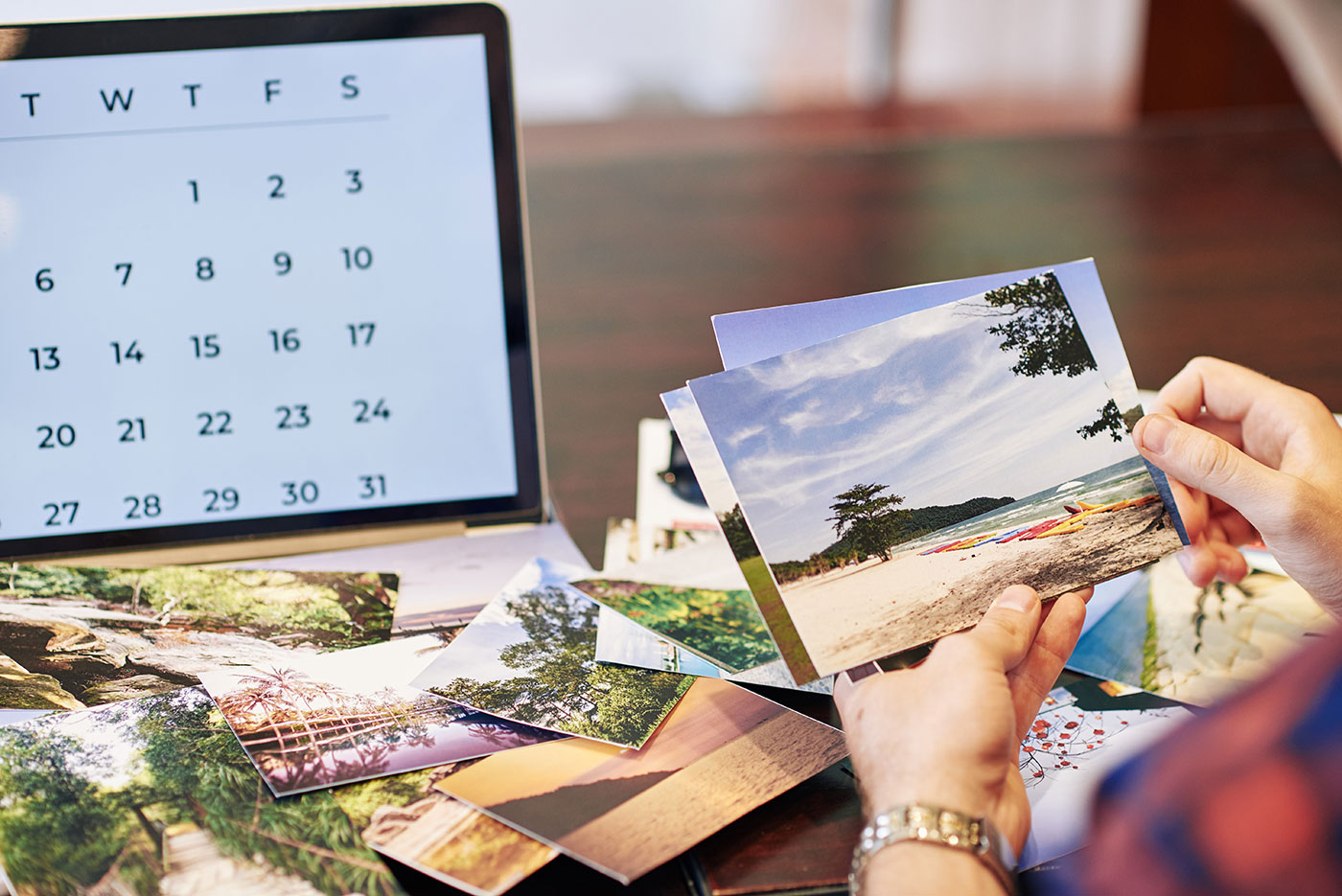
Seeing a finished image displayed online is always a nice feeling but actually holding a physical print gives a completely different type of satisfaction. It’s not until the image is printed and hung on a wall that the entire process is finished. However, making a good print is usually not as straightforward as one would think and most of us have experienced finding that the printed image doesn’t look nearly as good as it does online.
There are many reasons why they don’t look as good printed but most come back to the fact that we’ve failed to prepare the image for printing. We’ve simply just sent the processed file to the print lab (or our own printer). Unfortunately, it’s not that easy to get a good result without doing a bit more beforehand.
Don’t worry, though! It doesn’t take a lot of effort to get the printed image to look just as good as the online version. There are only a few simple steps we need to follow:
Calibrate the monitor
When did you last calibrate your monitor? Have you ever done it before? If not, do you know what it means?
Having a correctly calibrated monitor is the most important factor when you want to prepare images for printing. Without a calibrated monitor you won’t know what the image actually looks like.
Calibrating the monitor means to balance and correct its colors, typically done by using a spectrometer and calibration software. This is something everyone should do even if they don’t plan on printing an image. If the colors of your monitor are off, it means that all your images look different on other devices.
Regularly calibrating the monitor ensures that the colors you’re seeing on the screen are balanced properly and closely match the colors in the print.
I recommend calibrating your monitor at least once a month. However, the older your monitor is the more often you may have to calibrate it.
There are various tools out there that you can use to calibrate the monitor. Personally, I’ve been using Datacolor products for the past several years and have had excellent results with them. I’m currently using the SpyderX Pro model (don’t worry, these are super easy to use and don’t require any more than following a few basic steps).
Ask to view your photo on the printshop’s monitor before printing if you don’t have a calibrator yourself. You might be surprised how much the colors may vary quite if you haven’t calibrated your monitor.
Save your print file in sRGB or Adobe RGB
I know it might sound tempting to save your print files in ProPhoto as it’s a much larger color space but the fact is that most monitors and printers can’t show that wide range of colors.
Printing an image that’s saved in a larger color space than the printer can handle can lead to dull-looking images as the printer is out of gamut (meaning the colors aren’t able to be reproduced on the printer).
Most print labs will ask for your files in sRGB but certain high-end locations might be able to print on Adobe RGB. This is something you should check with them.
Save images as 8-bit
You may have heard of the terms 8-bit and 16-bit but you probably don’t know it’s meaning or how it affects your photo.
Simply put, a bit is the number of tones available to each color; an 8-bit image holds 16,000,000 colors compared to a 16-bit image that holds 28,000,000,000 colors.
So why should you save it as 8-bit if there are so many more colors in 16-bit? Wouldn’t you want all that extra information? Well yes, I suggest editing your images as a 16-bit file but when saving them for printing, you should opt for 8-bit.
The truth is that there is no difference in the print quality whether you save as 8-bit or 16-bit. Most printers aren’t quite able to print 16-bit files and automatically switch it to 8-bit; meaning saving images as 8-bit files makes them slightly smaller and quicker to transfer to a printer.
Choose the correct dpi
Dpi (i.e. dots per inch) is a key factor when talking about print resolution as it talks about the amount of dots printed in an inch. The more dots you have the more detail you have. This also means that the lower the resolution of your file is, the less detail it contains.
I recommend saving your images at 300 dpi when printing. You can get away with a lower dpi for smaller prints but you’ll lose detail in larger prints.
72 dpi is the standard for monitors but it`s too little for printing. A low-resolution iPhone image might look great on your computer but when enlarging it for a big print it’s most likely going to lack details and look pixelated.
Resize your images
Resizing the image might not be an essential step to prepare images for printing but I tend not to send the full-size image to be printed. Also, when printing large images we need to enlarge the file. Enlargement is slightly more complicated and is too big of a topic to cover in this article. However, I highly recommend Mark Metternich’s video course Mastering Fine Art Printing and Color Management which also goes into detail about enlargement.
Resizing the image is not time-consuming, though, if you’re not enlarging the image. Simply open the image in Adobe Photoshop then go to Image -> Image Size and choose the size you wish to print in (for example 16×24).
Crop the images
When using a full-frame camera or an ASP-C sensor (cropped sensor) you have an aspect ratio of 3:2. This is a perfect ratio for a 4×6 or 8×12 print but the aspect ratio changes when printing other standard sizes such as 5×7 (7:5) or 8×10 (5:4).
Le Levitra générique, également connu sous le nom de Vardenafil, est un traitement efficace contre la dysfonction érectile. Il fonctionne en augmentant le flux sanguin vers le pénis, facilitant ainsi l’obtention d’une érection. Si vous envisagez d’acheter du Levitra générique (Vardenafil), prenez en compte vos antécédents médicaux et les risques potentiels. Il est recommandé de suivre les instructions d’utilisation pour obtenir les meilleurs résultats.
Keep in mind when you’re cropping images for print that you may lose some of it due to the aspect ratio. You should always crop the image to the correct aspect ratio before sending it to the printer since a lot of print labs automatically crop without taking the image and composition into consideration. Ergo, it might not turn out the way you would like it.
Sharpen the image
The final processing-step of your printing workflow is to sharpen the image. This should be done after cropping it to the desired size.
If you’re a Photoshop user and already use Raya Pro, you might already know that you should resize and sharpen an image to make it optimal for the web. When preparing an image for printing you also need to sharpen the image but the methods will be slightly different.
An image that will be printed needs to be sharpened more than an image that is prepared for online display. In fact, you need to sharpen it until it almost looks like it’s too much (be aware, the line between over-sharpened and under-sharpened is thin).
How much you need to sharpen an image before printing varies with each image. Typically, images with a lot of details need to be sharpened more than images consisting of mostly sky or soft surfaces such as still water (keep in mind that we don’t want to add unnecessary noise when sharpening).
The size of a print also affects how much sharpening it needs; smaller prints tend to require slightly more sharpening than larger prints. This is because smaller images are compressed more and contain less information (which sounds quite the opposite of what you may think).
Choice of the print medium is another factor that affects how much sharpening an image needs:
- Canvas is the most forgiving material as it to some extent hides imperfections. This means that images that aren’t razor-sharp might still print well on it.
- Aluminum prints, on the other hand, are more crisp and detailed, therefore over sharpening (and noise) is more obvious.
- Traditional paper prints on an inkjet printer are somewhere between the other two mediums. Here it’s also important to consider the paper type (i.e. a heavy cotton paper can be different to a luster paper).
It might be helpful to consult your photo lab for advice on how a specific medium (or paper type) will handle your image.
Sharpening technique for prints
There are various methods to sharpen images for print but I prefer to use the Unsharp Mask in Adobe Photoshop and manually mask in the areas I wish to sharpen. This lets me have full control and target only specific areas of the image.
Soft proofing
Soft Proofing is a simple method used to visualize what the printed image will look like. You can do this in both Adobe Lightroom and Photoshop as well as in other photography-related software.
When Soft Proofing, you’re able to choose between different color spaces and different printers (plus make your own presets). With the correct printer and color space selected, you can continue making adjustments to the saturation, color balance and sharpness until the image resembles the original version.
A similar technique that was more common amongst photographers in the past was Hard Proofing, which means printing a test image and then making further adjustments afterward. While many still do this today, it is an expensive and time-consuming method especially considering you’re able to get almost as good a result by using Soft Proofing.
Conclusion
There are not many things more rewarding as a photographer than seeing your work printed, framed and hung on a wall, be it your own or someone else’s. Creating the perfect print takes some practice and by forgetting a few key elements the print might look nothing like what the digital file does.
Luckily, following the steps above will help you prepare for printing and get a finished product that you’re proud to hang on the wall.
If you choose to outsource your printing (which is quite likely unless you’ve purchased a professional printer), it’s important to mention that every print lab operates differently. It might take a few attempts before you find the lab that best satisfies your needs.


